Primary voter turnout map
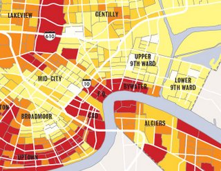
One of the most significant outcomes that may result from voter turnout trends, as illustrated in the map by Dan Swenson, and as the accompanying Times-Picayune article suggested, is that the more flood-devastated areas of the New Orleans may lose political power if they can't deliver votes:
Voters from Gentilly, the Lower 9th Ward, Central City and most of eastern New Orleans voted in far fewer numbers than neighborhoods spared by the flood, such as the French Quarter and Uptown, which saw moderate increases in turnout. The same did not hold true for flood-ravaged Lakeview, where voters turned out in nearly the same numbers as they did in the 2002 mayoral election, Logan said, attributing the higher Lakeview turnout to active civic groups that succeeded in motivating a relatively affluent populace.
Also note that the areas that voted for Nagin turned out in lower percentages than the areas that voted against Nagin (see the election results map). Those precincts contain much higher percentages of African-American voters.
Did they turn out in fewer numbers because they were displaced, and therefore had to work a little harder to vote? Or was the lower turnout due to lack of support for Nagin, as well as lack of support for his alternatives?
One thing is certain: the only way Nagin could conceivably win is by cranking up the voter turnout in the precincts he won.
posted by Schroeder @ 5:01 AM
0 comments
![]()


0 Comments:
Post a Comment
<< Home